Tampilkan postingan dengan label friendly. Tampilkan semua postingan

Minggu, 06 September 2015

DOWNLOAD RIGA FONT

Riga is a space-saving and legible typeface designed to work equally well on paper and on the computer screen. Its personality is clear and practical, yet warm and polite. Riga is suitable for a wide range of typography such as editorial, websites, packaging and corporate design. Economical proportions, high x-height and open letter forms guarantee good performance in narrow columns and tight headlines. Riga is exceptionally readable at small point sizes and elegant at larger ones.
Riga comes in 18 styles and weights and contains a large number of OpenType features. For small sizes on screen Riga Screen is also available.


Selasa, 25 Agustus 2015

DOWNLOAD SANELMA FONT

Sanelma is a brush script inspired by Hot Rod lettering and sign painting. Sanelma is a very versatile script: It includes two different styles of end swashes, swash caps, small caps, lots of alternate characters and underline option. All in all it has over 1,200 glyphs.
Sanelma is bouncy and smooth and has a very organic feel. You have a lot of options to customize it and that makes it perfect for logos, packages and titles.


DOWNLOAD CAMPTON FONT

Campton is a simple sans serif with a geometric skeleton, based on the mid to early twentieth century visual trend of achieving neutrality. Although there are a lot of typefaces focusing on similar principles, Campton tries to find its niche in the field of anonymous typefaces by combining simplicity with a subtle friendliness. It is perfectly suited for graphic design application ranging from editorial and corporate design via web and interaction design through to product design.


Senin, 10 Agustus 2015

DOWNLOAD GIST FONT

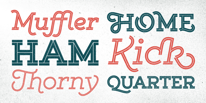
Gist from Yellow Design Studio is an inline slab serif with a retro yet modern vibe. It’s a collision between monoline slab and indie script. With 627 glyphs per weight, it’s highly customizable…either keep it simple with the base character set or use ligatures, alternates and swashes for extra flair. All-caps typesettings have an especially retro edge. Line layers are included for adding color to the inline areas. As a bonus, try Gist Light for free!
Also available: Gist Rough, the textured letterpress version. 


DOWNLOAD ROIHU FONT

Roihu is a sans serif type family with 16 fonts: eight upright and eight italic weights. Each weight offers more than 1,100 glyphs. Roihu includes some groovy stylistic alternates and swashes that make your titles, packaging, logos, etc. pop out.
Roihu also includes small caps, old style and lining figures, and ligatures to make sure your text and designs won't be boring.
Download the PDF specimen from the Roihu gallery to see more-specific OpenType instructions and a full glyph set.


DOWNLOAD LAPIS PRO FONT

Lapis was Jim Rimmer’s venture into a territory he'd earlier explored with his Lancelot and Fellowship faces. This time he stayed much longer, dug pretty deep, and had plenty of fun in there. The end result is the kind of mosaic of influences only a guy like Jim could consider, gather, manage and apply in a way that ultimately makes sense and works as a type family.


DOWNLOAD ARQUITECTA FONT

Arquitecta. The humanist typography as a rational project.
Since the experimentation from the Bauhaus through modern sans history we looked for a new mix to construct a rational geometric typeface with humanist proportions suitable for text layout and continuous reading.
Inspired by American & European hand lettering from the first half of the past century, Arquitecta finds his own space as a great alternative for paragraphs in front of classics like Futura, Kabel or Avant Garde.


DOWNLOAD CLEAR SANS TEXT FONT

Clear Sans™ is a… wait for it… rational geometric sans serif. It is intended to fill a niche… to provide an alternative to the somewhat based-on-vernacular signage, somewhat geometric sans. I hear the word vernacular thrown around too much and too loosely. If a typeface is based in the vernacular, based on hand-painted or hand-crafted signage, then it should be based on the movements of the hand, retain that warmth and not on a pretty geometric model. For me, clean, geometric and precise doesn't have to be cold and expressionless.


DOWNLOAD CABRITO FONT

After my son was born, I found myself reading him a lot of books. A LOT of books.
Some were good, some were great, but I found myself wanting to develop something using my skills and interests to make something that only I could make. In short, I realized my son needed to be indoctrinated--I mean, introduced into the wonderfully wild world of fonts. 


DOWNLOAD AL FRESCO FONT

Al Fresco is a breezy, light, yet expressive typeface perfect for packaging products and titling work that calls for a youthful, delectable flair. Its elegance carries a subtle earthiness; its beauty is unconventional, both stylish and exuberant. Al Fresco is made even more versatile when titling is activated (in the OpenType palette), served along with swash forms, contextual alternates, and ornaments to sweeten this tasty typeface.
As with my other type designs, Al Fresco doesn’t live in isolation, but evokes a special ambience, era, or lifestyle—in this case, an enviably carefree, chic, and organically trendsetting life, authentic and true to oneself and simply delicious. Naturally, each designer who uses my work filters it through their unique interpretation, imbuing the fonts with a wonderful array of results such as those found on menus, food packaging, branding for light colognes, or young, hip, clothing boutiques. Al Fresco was born in my imagination as an emblem of dining outside at twilight under twinkling lights, laughing warmly with friends, sipping signature cocktails and eating tapas—each bite dripping with intense flavor. In the workday setting, Al Fresco represents a style that is pretty but not dressy: swishy bright flowery skirts and cute little flats. “Business casual,” not cubicle prisoner. After all, Al Fresco comes from the 18th century Italian “in the fresh air.”


DOWNLOAD BLOG SCRIPT FONT

Technology is making it so that we’re all connected without the need for the physical-presence kind of being connected. That is strange, fascinating, and has a certain magnetism that is very difficult to resist. What’s at stake is no less than the transformation of centuries of human behaviour, and that’s part of the fascination. But while our existence morphs and we rush headlong into our socially minimalist future, we use our present culture to helplessly signal our nostalgia about our past. We know what our future will be missing, and we’re already full of nostalgia about it, but we know that what little we can do about isn’t going to affect the outcome that much.


DOWNLOAD BOHO FONT

Boho is inspired by a bohemian girl who is a free soul and creative spirit. She is a city girl, but she loves spending a lot of time outdoors and being close to nature. She loves art and going to the antiques and organic food markets. She is a wild and free spirit who knows no bounds.
Boho is Coto Mendoza’s first Script font family, which is based on gestual calligraphy with Cola pen. A first exposure to gestual strokes applied to font design can be seen in her previous work, Macarons.


Sabtu, 08 Agustus 2015

DOWNLOAD PH FONT

PH from Fontfabric Type Foundry is a multifaceted font system consisting of different font weights and type of condensation.
Every one of these font weights contains a number of extension types - Condensed, Narrow, Regular, Extended and Wide.
Along with all of this, you will also discover added groups of extras which could serve as a foundation or add that extra “cherry on the cake” to each unique design.


Rabu, 05 Agustus 2015

DOWNLOAD RUFINA STD FONT

Rufina was as tall and thin as a reed. Elegant but with that distance that well-defined forms seem to impose. Her voice, however, was sweeter, closer, and when she spoke her name, like a slow whisper, one felt like what she had come to say could be read in her image. Rufina’s story can only be told through a detour because her origin does not coincide with her birth. Rufina was born on a Sunday afternoon while her father was drawing black letters on a white background, and her mother was trying to join those same letters to form words that could tell a story. But her origin goes much further back, and that is why she is pierced by a story that precedes her, even though it is not her own. Maybe her origin can be traced back to that autumn night in which that tall man with that distant demeanor ran into that woman with that sweet smile and elegant aspect. He looked at her in such a way that he was trapped by that gaze, even though they found no words to say to each other, and they stayed in silence. Somehow, some words leaked into that gaze because since that moment they were never apart again. Later, after they started talking, projects started coming up and then coexistence and arguments, routines and mismatches. But in that chaos of crossed words in their life together, something was stable through the silence of the gazes. In those gazes, the silent words sustained that indescribable love that they didn't even try to understand. And in one of those silences, Rufina appeared, when that man told that woman that he needed a text to try out his new font, and she saw him look at her with that same fascination of the first time, and she started to write something with those forms that he was giving her as a gift. Rufina was as tall and thin as a reed, wrote her mother when Rufina was born.


Selasa, 04 Agustus 2015

DOWNLOAD DESTRA FONT

Destra is a contemporary, narrow serif family, suitable to save space and legible at small sizes. Its shapes are the result of a mix of styles. “Destra” is the Portuguese word for “right hand”.
The font has several OT features - fractions, old style-, lining-, tabular numbers, superiors/inferiors, alternative glyphs, dozens of ligatures (standard + discretionary) and an exclusive feature to convert Arabic to Roman numerals up to 1000 (download the “OT Features Guide” pdf). Moreover, Destra has an impeccable technical finish, with a systematic review of nodes, curves, spacing and internal data, eliminating the possibility of errors when using it.

DOWNLOAD ORGANICALLY FONT

Friendly and generous, this is an organically grown display typeface. Its original handcrafted shapes have been significantly polished, but without losing its old-fashioned charm. The versatile regular cut comes equipped with a wealth of decorative OpenType features such as swashes, majuscule discretionary ligatures and stylistic alternates.
The family also comes with a stylish set of useful ornaments and a very eye-catching spiky version. All hand made, with care.


Senin, 03 Agustus 2015

DOWNLOAD ADRIA SLAB FONT

Adria Slab is a smooth slab serif typeface that comes in seven weights and charming upright italics. Try combine it with its super friendly family member Adria Grotesk.
Enjoy making great typography with a vast choice of lining, tabular and old style figures, numerators, denominators, tabular figures, fractions, ligatures, some sweet symbols and even alternate arrows.

DOWNLOAD MELKSLIJTER FONT

With a stylish Dutch accent, this font draws inspiration from a 1935 brochure by the talented graphic designer and artist Dirk Hart. Carrying different hand-drawn lettershapes on upper and lower case slots despite being a unicase typeface, this font also brings a nice set of ornaments and complete sets of initial and terminal swash forms. When working with OpenType savvy applications these can conveniently be applied at the click of a button, thanks to the smart swashes programming, which will change the first and last letters in words with its corresponding initial or terminal forms. There are also some stylistic alternates for a (yet) more decorated look. The black version, with a somewhat art-deco feeling with added boldness, is also very decorative and contains the same features as the regular cut: smart swashes, different letterforms on upper and lowercase slots, ornaments and stylistic alternates.


DOWNLOAD LIBERTAD OFFICE FONT

Libertad is a sans-serif typeface that mixes humanist and grotesk models – It’s most interesting feature is the combination of balanced regulars with dynamic italics, wich makes it a very versatile font for diferent uses.
This special package is a special adaptation of Libertad, intended for Microsoft Office use with 4 variants.
Remember: Design can do without images, but not without typefaces.


Minggu, 02 Agustus 2015

DOWNLOAD FINI FONT

Fini. Done. You've just discovered an infinitely useful font that polishes things with youthful and stylish vigor. Fini provides playfulness with double letter ligatures with a twist of friendly sophistication. Fini Things, also designed by illustrator and font designer, Amy Dietrich, is a decorative collection of 26 loopy, spotty repeating border designs and kid oriented icons (like a pea coat, owl hat, hoodie, rubber duckie etc, plus a coffee cup - for mom and dad). Fini Things coordinates with Fini font, and in fact, works very nicely with Merci, and other Atlantic Fonts.