Tampilkan postingan dengan label informal. Tampilkan semua postingan

Senin, 07 September 2015

DOWNLOAD CONTO FONT


The Conto Super Family is a powerful and clear typeface for complex corporate typography. The 64 fonts gives you a wide range of flexibility to fulfill every typographical need. From essential reading text, captions and tables the Conto Family works also fine at large advertisement or packaging. Conto is simple, serious and elegant without loosing its independence. 
An almost never seen before set of ligatures make the fonts useful for logos and lettering!


Minggu, 06 September 2015

DOWNLOAD HORIZONTES SCRIPT FONT

Horizontes Script is the result of Panco’s personal experimental calligraphy project.
Designed with the goal of finding a balance between spontaneity, elegance and beauty, his first typography was born and inspired on the horizon´s blue line from the city he was born.
Relaxed, energic and very natural. With different alternatives of proportion, a wide range of ligatures, initial letters, terminals, floritures, Horizontes Script comes in two weight for large and small formats. 


DOWNLOAD PEACHES AND CREAM FONT

Peaches and Cream is a bold brush style script family of three weights, ornament set and an all caps font. Peaches and Cream is equipped with plenty of OpenType features: To activate the alternates click on Swash, Stylistic or Titling Alternates in any OpenType savvy program or manually select the characters from Glyph Palette.
Combine Peaches and Cream with Peaches and Cream Ornaments and Peaches and Cream Caps to complete your designs.
Peaches and Cream is an effective font for creating ambitious headlines, logos & posters with a custom-made feeling.


Senin, 10 Agustus 2015

DOWNLOAD ALVERATA FONT


Gerard Unger’s new typeface Alverata is a twenty-first-century type-face inspired by the shapes of romanesque capitals in inscriptions of the eleventh and twelfth centuries, without being a close imitation of them. It is additionally based on the early twentieth-century model, but tweaked so as to prevent blandness and monotony. 
Alverata performs beautifully in both screen and on paper, delivering excellent legibility. Its letters are open and friendly in small sizes and lively and attractive in large sizes. They are robust, and show refinement in their detail. It is an extensive type family, with versions for both formal and informal applications.


DOWNLOAD GLOSS DROP FONT

Gloss Drop is a wild hand lettered typeface, that passed the process of digitization without losing the spontaneous vibrancy of brush lettering. With the power of OpenType it gets real close to what you normally do with ink, brush and paper. If you noticed the absence of 300 swashes and flourished caps, you're right – this is not a Barbie Script dolled up for the next beauty contest. It is imperfection and naivety dripping from every letter that make this font stand out. An enviable choice formagazine headers, book covers or record covers. Works also well as a companion to hand-drawnor painted illustrations. Gloss Drop can even rock your Wedding designs if they are seeking for something that makes a difference.


Jumat, 07 Agustus 2015

DOWNLOAD DISTILLERY FONT

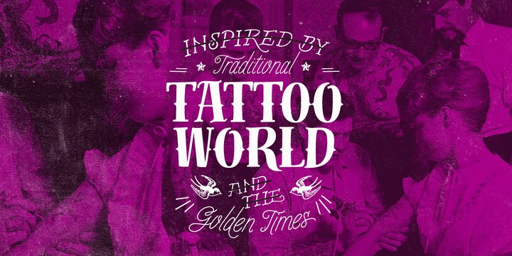
The Distillery Set is a collection of 5 fonts: Display, Strong, Script, Caps, and Icons. The fonts' influences are in lettering from different eras and styles. They reflect forms from the Arts & Crafts movement, the Roman majuscules, artistic printing, traditional tattoo lettering, sing painting and showcards from the early XX century and some typography trends started from 1970s America and being used today like chalkboard art or handmade labels in packaging. This is collection of fonts that strongly hints of the spontaneous ways of pencil on paper, the dynamic rebellion and simultaneous imperfection and elegance of DIY.


Selasa, 04 Agustus 2015

DOWNLOAD ORGANICALLY FONT

Friendly and generous, this is an organically grown display typeface. Its original handcrafted shapes have been significantly polished, but without losing its old-fashioned charm. The versatile regular cut comes equipped with a wealth of decorative OpenType features such as swashes, majuscule discretionary ligatures and stylistic alternates.
The family also comes with a stylish set of useful ornaments and a very eye-catching spiky version. All hand made, with care.


Senin, 03 Agustus 2015

DOWNLOAD NO SEVEN FONT


No. Seven is a bold brush style script family of three weights, ornament set and a block capital “small caps” font. No. Seven is equipped with plenty of OpenType features: To activate the alternates click on Swash, Contextual, Stylistic or Titling Alternates or Discretionary Ligatures, Tabular or OldStyle Lining in any OpenType savvy program or manually select the characters from Glyph Palette. Always keep on Standard Ligatures for the best outcome. 
Combine No. Seven with No. Seven Ornaments and No. Seven Small Caps to complete your designs. 
No. Seven is an effective font for creating ambitious headlines, logos & posters with a custom-made feeling. 
For the best price purchase the complete No. Seven Family.


DOWNLOAD BLITZPLAKAT FONT

Unearthed by our friend Dimitris Karaiskos in an antique shop in Vienna, we digitized it and added more glyphs.
Blitzplakat is the name of this pre-Letraset system, where you could make your own little advertising posters by cutting out these letters and sticking them on paper like stamps.


Minggu, 02 Agustus 2015

DOWNLOAD BREEZY FONT

»Breezy« is a brush script with very expressive strokes and surprising connections. »Breezy« is a great script if you really want to have that crude, rough feeling.


Jumat, 31 Juli 2015

DOWNLOAD DIMITRINA FONT

Dimitrina was created with a simple premise: Can there exist a typeface which features a minimum of sharp angles? And a readable typeface, as well? With these strict rules in mind, the development started. At first the typeface looked more like a script, and some characters ( M G or R, to name a few) still hold traces of a handwritten style which spices the overall taste of Dimitrina. Since the first draft every character was redrawn, and edited several times, for the purpose of making the typeface readable, and distinct at the same time.
Estimate for yourself if our goals are achieved, while you observe the three weights which are available exclusively in MyFonts. All of them feature a full set of characters plus cyrillic support. You can also try the regular weight which is offered free.


DOWNLOAD MARINE FONT

Marine font like as font in the part magazine, newspaper, or paper of brocure.

Mariné is a geometric sans but with the softness of humanistic strokes. It’s mild contrast and multiple different styles allow Mariné to work well as both a text and display font. It also includes an Up version and calligraphic features that add a touch of informality. Mariné is available in an extended family and is the close cousin of Amelia (available at MyFonts.com). All differences between Mariné and Amelia appear in the italic and Up versions.


Selasa, 28 Juli 2015

DOWNLOAD LINIGA FONT

A tall, warm and friendly handwritten typeface with a simple structure and low contrast. Works well for both display and body text.


Senin, 27 Juli 2015

DOWNLOAD FRIEDA FONT

Frieda is a handwritten calligraphy script equipped with contextual alternates features and ligature variations for a customised look. Just add "+" before the letter or manually choose the character from Glyph Palette. Authentic, chic, but also relaxed with a set of beginning and ending extensions. Frieda can be used for weddings, greeting cards, invitations, books, menus, advertising, etc.


DOWNLOAD CONTO NARROW FONT

Conto Narrow is a further member of the Conto Super Family. Download detailed PDF Specimen.
Other Members: Conto, Conto Condensed and Conto Compressed
The Conto Super Family is a powerful and clear typeface for complex corporate typography. The 64 fonts gives you a wide range of flexibility to fulfill every typographical need. From essential reading text, captions and tables the Conto Family works also fine at large advertisement or packaging. Conto is simple, serious and elegant without loosing its independence. 
An almost never seen before set of ligatures make the fonts useful for logos and lettering!


DOWNLOAD RENOVATION FONT

Renovation is a bold, brush-style typeface with an attitude. Modern, casual and slightly rough, it is edgy and demands attention. Renovation is perfect for headlines, posters, cards, covers, magazines and websites. It is urban, industrial and chic. As a display typeface, it is ideal for businesses that seek to add a hand-crafted, artisanal feel to their image.


Kamis, 09 Juli 2015

DOWNLOAD GEOGROTESQUE FONT

Geogrotesque is a semi modular with a subtle rounded finish typeface. All the characters are based in the same formal principle with its corresponding optical adjustments in order to adapt the system to an alphabet for texts. Although the type family has a geometric or “technological” construction, the rounded finish provides it a warm appearance, making the typefaces nicer and nearby. Geogrotesque has been conceived to be used as a display typeface in publications or intermediate length texts, most of all the Thin and Ultralight weights which were meant to be used in big sizes. The type family consists of 14 styles, 7 weights (Thin, UltraLight, Light, Regular, Medium, SemiBold and Bold) plus italics and it’s available in Open Type format. For a stencil version of Geogrotesque, please see Geogrotesque Stencil .


DOWNLOAD GRATITUDE SCRIPT FONT

The quality or feeling of being grateful or thankful. An appreciation for the world around us. Gratitude for being a part of it all.
No matter what’s happening in our lives, there’s always something to be grateful for. When we have an appreciation for all we have, life gives us more to feel grateful for. It’s a naturally occurring cycle.


DOWNLOAD GOODLIFE FONT

The Goodlife type family is a lovely handlettering collection designed by Hannes von Döhren. It contains six different hand drawn fonts with loads of features and a set of extras such as catchwords, arrows, ornaments & more. With this set and a little bit of love and care it is possible to create beautiful “handmade” graphics. Equipped with automatically exchanging alternates, ligatures, end forms, swash letters and some other features, Goodlife is optimized to feel not just like a font but like true handletterings.
Goodlife is made for complex, professional typography. The OpenType fonts have an extended character set to support Central and Eastern European as well as Western European languages.


Rabu, 08 Juli 2015

DOWNLOAD PROXIMA NOVA FONT

The Proxima Nova family is a complete reworking of Proxima Sans (1994). The original six fonts (three weights with italics) have been expanded to 48 full-featured OpenType fonts. There are three widths: Proxima Nova, Proxima Nova Condensed, and Proxima Nova Extra Condensed. Each width consists of 16 fonts—seven weights with matching italics.
Stylistically, Proxima Nova straddles the gap between typefaces like Futura and Akzidenz Grotesk. The result is a hybrid combining humanistic proportions with a somewhat geometric appearance.