Tampilkan postingan dengan label fancy. Tampilkan semua postingan

Minggu, 06 September 2015

DOWNLOAD TOLYER FONT

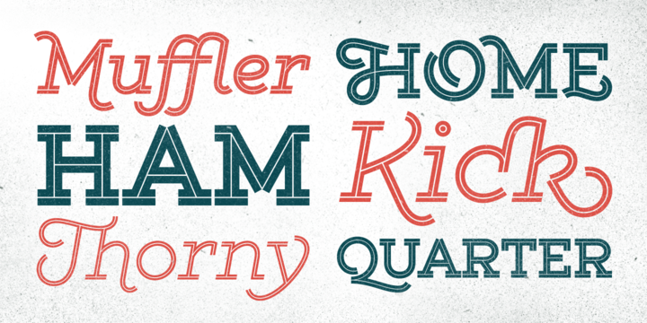
Tolyer font is an extra large super family of 50 fonts! In many cases quantity doesn’t mean quality but here we have such a big abundance of contrast, styles, weights and special effects in one place that it actually doesn’t pay attention to the fact this is an all caps family. When it comes to strong headlines, titles, posters, masculine brand names Tolyer type family is probably one of the best choices in sans serif typography. You could easily pick from low to high contrast outlines, uprights and obliques, 3D effects or different artistic textured styles to make your work diverse, expressive and attractive. Tolyer font offers you maximum readability even in poor display conditions like low quality printing or low resolution monitors. In some cases poor print quality could even add more value to the final result, because Tolyer has a lot of potential to be used in difficult conditions. Letterpress and high embossing are one of those print effects that really suit Tolyer best. Use it in high contrast with background environment, higher ink flow, don’t think about the dot gain and you should definitely use a textured paper – this is what Tolyer really likes and deserves. It will thank you for this with authentic look, classic vintage style and strong but attractive presence.


Selasa, 25 Agustus 2015

DOWNLOAD HEROE FONT

DESCRIPTION
Now my feelings about didones are more than evident. After some years of roman-abstinence (1) I present Heroe, an interesting combination of elegance and sensuality.
Heroe, spanish for hero, takes some aspects of roman typefaces to the extreme like my main inspiration, the great Herb Lubalin, did in the majority of his works: Thins turned into hairlines, altered proportions (for display purposes), unique ball terminals, poetic curves and a graceful way of placing them together on a layout.


Senin, 10 Agustus 2015

DOWNLOAD GIST FONT

Gist from Yellow Design Studio is an inline slab serif with a retro yet modern vibe. It’s a collision between monoline slab and indie script. With 627 glyphs per weight, it’s highly customizable…either keep it simple with the base character set or use ligatures, alternates and swashes for extra flair. All-caps typesettings have an especially retro edge. Line layers are included for adding color to the inline areas. As a bonus, try Gist Light for free!
Also available: Gist Rough, the textured letterpress version. 


DOWNLOAD AL FRESCO FONT

Al Fresco is a breezy, light, yet expressive typeface perfect for packaging products and titling work that calls for a youthful, delectable flair. Its elegance carries a subtle earthiness; its beauty is unconventional, both stylish and exuberant. Al Fresco is made even more versatile when titling is activated (in the OpenType palette), served along with swash forms, contextual alternates, and ornaments to sweeten this tasty typeface.
As with my other type designs, Al Fresco doesn’t live in isolation, but evokes a special ambience, era, or lifestyle—in this case, an enviably carefree, chic, and organically trendsetting life, authentic and true to oneself and simply delicious. Naturally, each designer who uses my work filters it through their unique interpretation, imbuing the fonts with a wonderful array of results such as those found on menus, food packaging, branding for light colognes, or young, hip, clothing boutiques. Al Fresco was born in my imagination as an emblem of dining outside at twilight under twinkling lights, laughing warmly with friends, sipping signature cocktails and eating tapas—each bite dripping with intense flavor. In the workday setting, Al Fresco represents a style that is pretty but not dressy: swishy bright flowery skirts and cute little flats. “Business casual,” not cubicle prisoner. After all, Al Fresco comes from the 18th century Italian “in the fresh air.”


DOWNLOAD BLOG SCRIPT FONT

Technology is making it so that we’re all connected without the need for the physical-presence kind of being connected. That is strange, fascinating, and has a certain magnetism that is very difficult to resist. What’s at stake is no less than the transformation of centuries of human behaviour, and that’s part of the fascination. But while our existence morphs and we rush headlong into our socially minimalist future, we use our present culture to helplessly signal our nostalgia about our past. We know what our future will be missing, and we’re already full of nostalgia about it, but we know that what little we can do about isn’t going to affect the outcome that much.


DOWNLOAD INDIE FONT

A FEW THOUGHTS
Indie is a trendy script, result of the wide range of possibilities that can be achieved using a pointed brush. (1)
“You Only Live Once” say The Strokes, (to me, symbols of indie music) so, what would represent that sensation of volatility better than a brush?


DOWNLOAD BOHO FONT

Boho is inspired by a bohemian girl who is a free soul and creative spirit. She is a city girl, but she loves spending a lot of time outdoors and being close to nature. She loves art and going to the antiques and organic food markets. She is a wild and free spirit who knows no bounds.
Boho is Coto Mendoza’s first Script font family, which is based on gestual calligraphy with Cola pen. A first exposure to gestual strokes applied to font design can be seen in her previous work, Macarons.


Sabtu, 08 Agustus 2015

DOWNLOAD THRISTY SOFT FONT

Thirsty Soft from Yellow Design Studio is the rounder, warmer, extra-vintage version of Thirsty Script. While the original Thirsty Script has a caffeinated demeanor with sharp edges and pointed terminals, Thirsty Soft is warm and buttery smooth, adding friendliness and and extra level of vintage appeal.
Features include six weights from Light to Black, old-style figures, stem alternates (accessed by using the opentype feature “swash”), multiple language support, ligatures and stylistic alternates.
Tips: 
- In Photoshop switching the anti-aliasing setting to “smooth” may yield the best results.


    Selasa, 04 Agustus 2015

    DOWNLOAD ORGANICALLY FONT

    Friendly and generous, this is an organically grown display typeface. Its original handcrafted shapes have been significantly polished, but without losing its old-fashioned charm. The versatile regular cut comes equipped with a wealth of decorative OpenType features such as swashes, majuscule discretionary ligatures and stylistic alternates.
    The family also comes with a stylish set of useful ornaments and a very eye-catching spiky version. All hand made, with care.


    Senin, 03 Agustus 2015

    DOWNLOAD PERIPLUS FONT


    I got rhythm, I got music, I got my swirls, who could ask for anything more? 

    Periplus is quite an eccentric type, full of twists and nice oddities here and there. 
    It is an all-caps font with 2 variations for each letter and number, stored at upper- and lower-case slots. 
    For added amusement, every letter got not 1 or 2, but 4 swash variations. One can be reached through the OpenType swash feature: just select the letter and hit the swash button. The other ones you will access through a glyphs palette. All of them are neatly organized with the ‘access all alternates’ feature. 
    The font is yet equipped with some stylistic alternates and ornaments. 
    Have fun!


    DOWNLOAD 1512 INITIALS FONT

    This set of initial decorated letters is an entirely original creation, drawn inspired by Italian renaissance patterns. It contains two roman alphabets : one drawn in white on black background and the other in black on white. We have included a few fleurons and decorative elements.
    It can be used as variously as web-site titles, posters and flyers design, publishing texts looking like ancient ones, or greeting cards, all various sorts of presentations, as a very decorative, elegant and luxurious additional font.


    Kamis, 30 Juli 2015

    DOWNLOAD MARMELADE FONT

    »Marmelade« is a useful script, always ready to adorn that latest jam-jelly-confiture-marmelade project. It is a joining-script, or a script with printed small caps, whatever you like. Marmelade comes in two different scripts »Basic« and »Plus«, and one »Print« set with small caps. I added a set with »Start-and-End« letters as well as one set with those long »Underswings« below the caps. For good measure I give you three sets of readymade »Words« in English, French and German. Last not least there is a set of »Fruit« sketches that come in handy for everyday jams. I sell all the flavors in one set only, but at a boiled down price. Enjoy!


    Senin, 27 Juli 2015

    DOWNLOAD ARX FONT

    Arx by Superfried is an elegant and intricate display typeface designed for use at large scale. Its Latin name - meaning citadel - connects with the classical features, whilst the phonetic pronunciation nods to the arcs which characterise each glyph.
    This caps typeface is available in two formats: fade and solid, each featuring two distinct character styles switched via the shift key. Fade features delicate incisions to add depth and the illusion of 3D shading to the arcs. Solid, as its name suggests, is a cleaner, flat alternative.


    Minggu, 26 Juli 2015

    DOWNLOAD JAZZNIK FONT

    “Dig that crazy beat, daddio!” That’s what all the cats and kittens are saying about that nutty, way-out Jazznik. I mean, there’s a whole Jazznik family that’s like a hot midnight jam session… with no squares allowed!
    Count it off with Jazznik Regular, bebop till you drop with Jazznik Light, and swing it hard with Jazznik Dark. Plus there’s italics in every weight to top it off your favorite lid, Sid! You say you wanna trade some more licks? Well syncopate that mess with Jazznik Riffs, a whole bunch of real-gone graphic goodies. Then frame it all out with Jazznik Rhythms to take it straight uptown!


    Sabtu, 25 Juli 2015

    DOWNLOAD BELLICO FONT

    Bellico is a beauty script typeface with a large range of alternates that fits any kind of various purpose with a bunch of alternative character to easily create cool text,logos, headlines. etc. available through OpenType features. The OpenType features can be accessed by using OpenType savvy program.


    DOWNLOAD MARIS FONT

    For a limited time, get Maris Halftone Bold, free with a tweet!
    Maris is a rich, elegant script, subtly characterized by a whimsical handwritten calligraphy. The family is composed of six different weights, each one bolder than the last but all equally as filling. The lighter weights move delicately through each line, showing a gentle strength in their smaller frame. The six weights from these lighter forms to the bold include some textured versions such as jean, wood, print, rough and halftones. 


    DOWNLOAD JOURNEY FONT

    Journey is a smooth and elegant vintage script family of four weights and a matching ornament set. Journey is packed with Alternate characters that let you easily create headlines, logos & posters with a custom-made feeling.
    Journey has a minimum three alternatives to every basic letter: To activate the alternates click on Swash, Stylistic or Titling Alternates in any OpenType Savvy program or manually choose from even more alternate characters from the Glyph Palette.
    For the best price purchase the Complete Journey Family.


    DOWNLOAD BLOG SCRIPT FONT

    Technology is making it so that we’re all connected without the need for the physical-presence kind of being connected. That is strange, fascinating, and has a certain magnetism that is very difficult to resist. What’s at stake is no less than the transformation of centuries of human behaviour, and that’s part of the fascination. But while our existence morphs and we rush headlong into our socially minimalist future, we use our present culture to helplessly signal our nostalgia about our past. We know what our future will be missing, and we’re already full of nostalgia about it, but we know that what little we can do about isn’t going to affect the outcome that much.


    Selasa, 14 Juli 2015

    DOWNLOAD SNOWCONE PRO FONT


    Snow Cone Pro is a hand drawn font family consisting of 6 playful typefaces. Snow Cone Pro brings a fresh splash of summer to your designs. You can change the appearance of each font by playing with the open type features, such as interlocking pairs, double letter ligatures, stylistic alternates. 
    As a bonus you can download Snow Cone Doodle for free. 150 little drawings to complement the 6 Snow Cone fonts. So play away and have some fun! 
    You will need an Open Type Savvy Application to get the most out of Snow Cone Pro.


    DOWNLOAD BELLWETHERS FONT

    Meet Bellwethers... a fancy, doodley, hand-drawn typeface with swashes galore. Perfect to add a little whimsy and carefree elegance to your next project.
    This font contains 6 separate fonts that include a full-on smorgasbord of swash letterforms. Swashes are easily accessible by simply dropping text into your desired swash font.
    To use a swash font, type lowercase a-z for the initial (Beginning of the word) font swashes and type uppercase A-Z for the terminal (Tail of the word) swashes. Fonts come as .otf files.