Tampilkan postingan dengan label text. Tampilkan semua postingan

Minggu, 20 September 2015

DOWNLOAD KARDIA FONT

Kardia is a versatile type family that lets you compose a wide range of texts, from extensive reading materials to striking, eye-catching headlines and titles.
Features include ample proportions that have been revised to maintain similar line performance across all its weights. It also has an elevated x-height which facilitates reading in small bodies, in addition to help building solid headlines.
Inspired by brush lettering, it takes many features from calligraphic strokes and the foundational style, adapted to a contemporary typographic language.


Senin, 14 September 2015

DOWNLOAD TEXTA FONT

Texta. A Sans for All.
Through studying humanists' models from Edward Johnston to Adrian Frutiger and the Gothic Alphabet made by sign painters comes Texta, a contemporary, rational, transparent and useful Sans to compose all kind of texts. We incorporated an Alt version that replaces lower cases like a-g-y with geometric constructions to get more versatility in neutral compositions.


Jumat, 11 September 2015

DOWNLOAD DIOGENES FONT

Diogenes is an elegant and crisp text typeface. While the skeletons of the individual characters are distinct and strong, the serifs are fine and sharp. This is especially true for the capitals with their comparatively strong horizontal strokes. The graceful appearance of Diogenes makes it an ideal choice for books, newspapers, and magazines, both at small text sizes and display sizes. See also this minisite.


Senin, 07 September 2015

DOWNLOAD CONTO FONT


The Conto Super Family is a powerful and clear typeface for complex corporate typography. The 64 fonts gives you a wide range of flexibility to fulfill every typographical need. From essential reading text, captions and tables the Conto Family works also fine at large advertisement or packaging. Conto is simple, serious and elegant without loosing its independence. 
An almost never seen before set of ligatures make the fonts useful for logos and lettering!


DOWNLOAD PEPONE FONT

This typeface is primarily optimized for the setting of belles-lettres. The regular styles are balanced to suit small text sizes and enable the reading of long portions of text. The development of the typeface was guided by the goal of creating a contemporary, discreet book serif, with modern expression and numerous functions. Letters feature reduced contrast, the lighter styles may evoke wired letters, while the heavier ones bear distinct slab serif references. The extremes thus work in harmony and fulfil the demanding requirements of advertising and magazine layout. The typeface is suitable for bottle labels, invitations, exhibition catalogs and posters, for printed and online presentations alike.


Minggu, 06 September 2015

DOWNLOAD RUTH PRO FONT

Ruth Pro is a creative work horse primarily designed to be used for typographic design of magazines, posters and books. Though roughly inspired by fonts like Mendoza and Stone Serif, it has its own distinctive look, carefully crafted following all the classic ideals of typography. If you are also looking for that special display font, you will be surprised by all the great details of Ruth Pro, including dingbats, arrows, alternative characters, special designed ligatures and small caps characters—and much more! Ruth Pro also includes a vast selection of Slavic and Scandinavian characters.


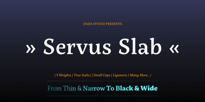
DOWNLOAD SERVUS SLAB FONT

This family is very special to me. I started working on it right after my first son was born. I decided to name the typeface “Servus” which means “Hello” in my country. The whole idea of the family symbolizes a child’s growth. It starts with Thin and Narrow weights - just like a newborn baby - then it slowly grows to Black and Wide. As You can guess, my son is quite chubby now!
And I can assure You that I put all my love into details.


DOWNLOAD FREIGHT MACRO PRO FONT

Freight Macro, the quintessential cousin of Freight Micro Pro, is a sturdy, slab serif design. The medium and bolder weights are well suited for magazine and newspaper section heads, headlines and book covers while the light and book weights are geared for extended reading in newspapers, magazines, technical manuals, catalogues and cookbooks. Freight Macro’s orderly and straightforward design is also well suited for corporate branding in the health care, food and beverage and automotive industries, and is well-formed for use in campaigns and logos.


Selasa, 25 Agustus 2015

DOWNLOAD QUIRE SANS FONT

"My goal was to make a design that might fit in anywhere,” says Jim Ford about his Quire Sans™ typeface. “I wanted it to be highly functional and sexy at the same time.” With one foot comfortably in the realm of oldstyle design and traditional book typography, and the other in evolving electronic media, the Quire Sans family does, indeed, fit in just about anywhere. As for sexy, someone once quotably wrote, “A great figure or physique is nice, but it’s self-confidence that makes someone really sexy.” Yes, Quire Sans is sexy, performing confidently in virtually any setting.


DOWNLOAD URBAN GROTESK FONT

Urban Grotesk attempts to follow the best of traditions of Grotesk typefaces: rounded arches, slightly thinner connecting strokes and a vertical shadowing axis, where outstrokes are terminated strictly in perpendicular to the stroke direction. The primary characteristics are the connection of the rounded stroke to the stem, a round dot, lower and more thrifty uppercase, and generous numerals. The width proportions of characters is almost unified, the text colour creates a unified grey area on a page. An airy metric aids good legibility in shorter texts.


DOWNLOAD GAUTHIER NEXT FY FONT

Our famous Gauthier FY Gauthier FY is now available with an extended character set, including small caps! 
Inspired by Renaissance typefaces, Gauthier FY is a contemporary old-style serif typeface with big x-heights and quite small caps. Accompanied by a lovely and detailed italic – inspired by artworks from the punchcutter Granjon – Gauthier FY is perfect for any text design.

Gauthier Next FY was created by Jérémie Hornus & Alisa Nowak on co-create.fontyou.com, the first collaborative type foundry.


DOWNLOAD CARDEA FONT

The Cardea family of typefaces is the outcome of David Cabianca’s 2003–04 MA Typeface Design experience at the University of Reading. With Cardea, Cabianca intended to mix classical and modern characteristics, and in the process he created a typeface that “sparkles” on the page, with high contrast, luster and crisp edges. The result is a type with a muscular or sculptural feel much like the work of 
artists like Arne Quinze or Mark di Suvero.

Cardea was designed to function as a text face. It features three weights each with accompanying italics, small caps and a variety of ligatures.


DOWNLOAD CAMPAN FONT

Campan, is a new semi-linear face which unites mono-line and classic elements. It is very strong in headlines and its tall x-height lends itself to comfortable reading in text applications.
The Campan family comprises 12 styles and is well suited for ambitious typography. It comes in OpenType format with extended language support. All weights contain ligatures, small caps, proportional lining figures, tabular lining figures, proportional old style figures, lining old style figures, matching currency symbols, fraction- and scientific numerals and matching arrows.


DOWNLOAD DSARI FONT


It is inspired by the friendliness and cordiality of neo-humanist typefaces with a mix of rounded shapes, some apexed characters, and a little bit of black. Although it follows the ductus, D Sari is also a daring font with less pointed shapes, as is the case with regular neo-humanist typefaces. 
D Sari has 22 variants, which make it a very dynamic typeface. Well-suited for highlighting lettering, magazines, motion graphics, advertising, logotypes, signs, etc.


DOWNLOAD DARWIN FONT

Darwin font family is a eclectic assembly of grotesque, geometric and humanistic styles, includes 20 fonts, 10 normal and 10 alt sub family, the alt variant gives spice to the compositions. The font family is good for headlines, little text, posters and logos.


Senin, 10 Agustus 2015

DOWNLOAD LARSSEIT FONT

Larsseit is a sans which mixes a very low contrast and classical proportions. Larsseit emphasizes cleanliness, readability and objectivity. The Larsseit family includes 6 weights, from UltraThin to Black, with their corresponding italics and Small Caps. Each font includes OpenType Features such as Proportional Figures, Tabular Figures, Numerators, Superscripts, Denominators, Scientific Inferiors, Subscript, Ordinals, Ligatures and Fractions.


DOWNLOAD XALOC FONT

Xaloc was designed for editorial use in books, magazines and newspapers. This typeface family contains different font versions for different optical sizes; Caption, Text, Subhead and Display, all of them with different x-height proportions and contrast. Its serifs are asymmetrical and its letterforms have geometric modulated strokes that emulate the calligraphic variations. Its design approach enhances text flow and continuous reading. Xaloc was based on Ricado Santos’ Tramuntana, which has the same skeleton, proportions and serifs with a more mechanical design. Xaloc is the Catalonian name from the Mediterranean wind that comes from the Sahara and reaches hurricane speeds in North Africa and Southern Europe.


DOWNLOAD BRENTA FONT

Brenta is a crisp typeface with open counters and compact proportions, its name referring to a range of mountains in northern Italy. Like its namesake, Brenta is characterized by sharp-edged and sturdy forms, but also by its clarity and elegance. Strong serifs, flat and bold shoulders and open terminals pronounce the horizontal and help to guide the eye along the line. Very fine junctures keep the characters sharply defined and create dynamic light traps. 


DOWNLOAD KOMET PRO FONT

Komet is a sturdy typeface with a calm and upright feel. Although it derives inspiration from classical English sans-serifs, it’s not too closely related to that model. Komet, instead, feels rather more lively and contemporary.
Its compact spacing, low stroke contrast and heavy dots and accents give it an almost monolinear quality. The diagonals are slightly curved and the counters of the round letters such as b, o and q are generously wide. The muted, understated middle weights are built for extended body copy, while Komet’s thin and dark weights look brisk and assertive and make for subtly expressive headlines.


DOWNLOAD CLARA SERIF FONT

Clara is a set of alphabets of interconnected serif and sans serif fonts. The connection is not only in the intensity of the strokes, i.e. in the identical brightness of the typesetting, but also in the drawing principles of both alphabets. The typeface aims to offer a sense of calmness for a reader even in smaller scales of the typesetting. In large scales it builds on the purity of the image without additional decorations. The Clara system includes maximum equipment of a Latin font from Thin to Black in all versions of marking fonts, italics, capital letters and four kinds of numbers. The typeface allows typesetting of the vast majority of cultural languages of the world.