Tampilkan postingan dengan label capital sharp s. Tampilkan semua postingan

Minggu, 20 September 2015

DOWNLOAD KARDIA FONT

Kardia is a versatile type family that lets you compose a wide range of texts, from extensive reading materials to striking, eye-catching headlines and titles.
Features include ample proportions that have been revised to maintain similar line performance across all its weights. It also has an elevated x-height which facilitates reading in small bodies, in addition to help building solid headlines.
Inspired by brush lettering, it takes many features from calligraphic strokes and the foundational style, adapted to a contemporary typographic language.


DOWNLOAD PRATT NOVA FONT

Shaped by constraint to accommodate a large character count, Pratt Nova has massive form: semi-condensed, large x-height, short descenders and capitals. And yet it transcends its restrictive origins in abundance, expressing a spirit of visual and semantic opulence, equipping the typographer with a comprehensive array of harmonized fonts, all rigorously drawn, superbly fitted iterations of a single, profoundly original design.
The set of Text styles contain additional glyphs and OpenType features.


DOWNLOAD DIN NEXT SLAB FONT


The new DIN Next Slab: 
Now even more design possibilities with the popular DIN Next. With its technical and neutral character, DIN Next has earned a permanent place in contemporary typography. Now, DIN Next Slab expands the font family further, offering new design potential. 
Now comes the next step, DIN Next Slab, also produced under the direction of Akira Kobayashi. On a team with Sandra Winter and Tom Grace, Kobayashi is creating the new font variant based on the optimized shapes of DIN Next. The expansion will make the popular font all the more flexible and versatile. Apart from that, the geometric slab serifs underline the technical and formal nature of the font and emphasize a central design element of DIN Next. 
However, the team did have some challenges to overcome. While it is relatively easy to imagine DIN Next Light with slab serifs, the amount of available space quickly disappears when it comes to the Black styles. Winter explains that many tests and trials were necessary to find a compromise between space, letters and the serif shapes. Experiments with modified contrast in the weight or only one-sided serifs were quickly abandoned. The central, technical and powerful character of the font changed too much. Nevertheless, it was necessary to simplify slightly the shape of some letters, such as the ‘k’ or ‘x’, for example. These changes, first developed in the Black styles, were applied to all weights in order to lend the font a consistent appearance. 
Like DIN Next, DIN Next Slab also has seven weights, which cover the range from Ultralight to Black, each with matching italic. There are various character sets in all of the styles and the four middle weights have small capitals available. 
DIN Next Slab harmonizes perfectly with the styles of DIN Next: the basic letterforms and weights are identical. Both versions of the font can work together perfectly, not just in headlines and body text, but also within a text; they complement each other very well as design variations. With the new DIN Next Slab, Monotype expands the DIN Next super family consistently. With DIN Next Slab, you can underscore the technical and formal nature of the understated font not only in headlines, but in texts, as well. In this way, you have new and diverse potential for application, thanks to the way the different styles of DIN Next combine perfectly.


Jumat, 11 September 2015

DOWNLOAD GIBBS FONT

Gibbs is a tough, sophisticated sans, named for prolific maritime architect William Francis Gibbs and inspired by his greatest design, the record-breaking mid-century luxury liner SS United States. Taking various cues from the unique cast aluminum signs found on board, the result is truly transatlantic — somewhere in between industrial American vernacular lettering and the English humanist styles of Gill or Johnston. Both stylish and comfortable to read, and with an extensive list of OpenType features, Gibbs allows you to set quality type with ease at both text and display sizes.


Minggu, 06 September 2015

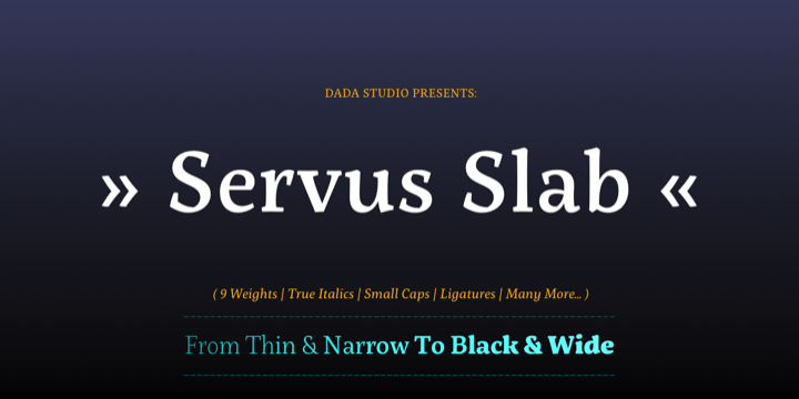
DOWNLOAD SERVUS SLAB FONT

This family is very special to me. I started working on it right after my first son was born. I decided to name the typeface “Servus” which means “Hello” in my country. The whole idea of the family symbolizes a child’s growth. It starts with Thin and Narrow weights - just like a newborn baby - then it slowly grows to Black and Wide. As You can guess, my son is quite chubby now!
And I can assure You that I put all my love into details.


DOWNLOAD FF FRANZISKA FONT

German type designer Jakob Runge created this FontFont in 2014.
The family has 20 weights and is ideally suited for advertising & packaging, logo, branding as well as web & screen design.
FF Franziska provides advanced typographical support with features such as ligatures, small capitals, alternate characters, case-sensitive forms, fractions, and super- and subscript characters.


DOWNLOAD RIGA FONT

Riga is a space-saving and legible typeface designed to work equally well on paper and on the computer screen. Its personality is clear and practical, yet warm and polite. Riga is suitable for a wide range of typography such as editorial, websites, packaging and corporate design. Economical proportions, high x-height and open letter forms guarantee good performance in narrow columns and tight headlines. Riga is exceptionally readable at small point sizes and elegant at larger ones.
Riga comes in 18 styles and weights and contains a large number of OpenType features. For small sizes on screen Riga Screen is also available.


Selasa, 25 Agustus 2015

DOWNLOAD EVELETH FONT

Eveleth from Yellow Design Studio is a premium high-resolution letterpress family with exceptional realism and vintage charm. It features 3 different sub-families each with its own unique printed texture. Each sub-family offers six distress options per letter and 3 options for all other characters allowing incredible control and customization. Bonus “spurs” have been included in every weight to add retro flair. Other features include a complimentary Thin weight, a shadow layer, a set of funky icons, a collection of useful shapes and emblems, and clean (non-distressed) versions.
The font package includes character maps for the Icons and Shapes plus instructions for adding spurs.


DOWNLOAD URBAN GROTESK FONT

Urban Grotesk attempts to follow the best of traditions of Grotesk typefaces: rounded arches, slightly thinner connecting strokes and a vertical shadowing axis, where outstrokes are terminated strictly in perpendicular to the stroke direction. The primary characteristics are the connection of the rounded stroke to the stem, a round dot, lower and more thrifty uppercase, and generous numerals. The width proportions of characters is almost unified, the text colour creates a unified grey area on a page. An airy metric aids good legibility in shorter texts.


DOWNLAOD FF QUIXO FONT

German type designer Frank Grießhammer created this serif FontFont in 2013.
The family contains 12 weights from Light to Black and is ideally suited for film, tv, advertising, packaging, editorial, publishing, logo, branding, music, nightlife, software, gaming, sports as well as web and screen design.
FF Quixo provides advanced typographical support with features such as ligatures, alternate characters, case-sensitive forms, fractions, super- and subscript characters, symbols and stylistic alternates.


Senin, 10 Agustus 2015

DOWNLOAD GIST FONT

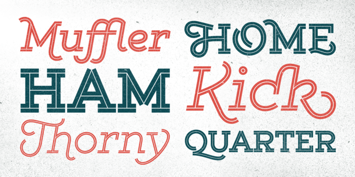
Gist from Yellow Design Studio is an inline slab serif with a retro yet modern vibe. It’s a collision between monoline slab and indie script. With 627 glyphs per weight, it’s highly customizable…either keep it simple with the base character set or use ligatures, alternates and swashes for extra flair. All-caps typesettings have an especially retro edge. Line layers are included for adding color to the inline areas. As a bonus, try Gist Light for free!
Also available: Gist Rough, the textured letterpress version. 


DOWNLOAD KOMET PRO FONT

Komet is a sturdy typeface with a calm and upright feel. Although it derives inspiration from classical English sans-serifs, it’s not too closely related to that model. Komet, instead, feels rather more lively and contemporary.
Its compact spacing, low stroke contrast and heavy dots and accents give it an almost monolinear quality. The diagonals are slightly curved and the counters of the round letters such as b, o and q are generously wide. The muted, understated middle weights are built for extended body copy, while Komet’s thin and dark weights look brisk and assertive and make for subtly expressive headlines.


Selasa, 04 Agustus 2015

DOWNLOAD AMERICAN CAPTAIN FONT

American Captain is as a 6-font family with complete character sets and language support for Central European characters, Cyrillic, Greek and Hebrew. OpenType features include: small caps, fractions, stylistic sets, glyph replacements, etc.


Senin, 03 Agustus 2015

DOWNLOAD ADRIA SLAB FONT

Adria Slab is a smooth slab serif typeface that comes in seven weights and charming upright italics. Try combine it with its super friendly family member Adria Grotesk.
Enjoy making great typography with a vast choice of lining, tabular and old style figures, numerators, denominators, tabular figures, fractions, ligatures, some sweet symbols and even alternate arrows.

DOWNLOAD LIBERTAD OFFICE FONT

Libertad is a sans-serif typeface that mixes humanist and grotesk models – It’s most interesting feature is the combination of balanced regulars with dynamic italics, wich makes it a very versatile font for diferent uses.
This special package is a special adaptation of Libertad, intended for Microsoft Office use with 4 variants.
Remember: Design can do without images, but not without typefaces.


DOWNLOAD TT DAYS SANS FONT

Days Sans is a qualitative reincarnation of the legendary free font Days. Now it is a modern interpretation of an old font. We added in this fontfamily new typefaces and support for many codepages and languages.
The fonts are very convenient to use in web, mobile apps and in desktop computers. The font family Days Sans contains many languages and alphabets, as well as compatible with other TypeType fonts.