Tampilkan postingan dengan label advertising. Tampilkan semua postingan

Minggu, 20 September 2015

DOWNLOAD ROPA SOFT FONT

Ropa Soft Pro is Ropa Sans Pro’s charming sister. While Ropa Sans is cool and somewhat technical, almost like brushed steel, the new Ropa Soft Pro family brings a warm and friendly feel, closer to smoked wood, through its rounded corners.
The medium weights of Ropa Sans Pro serve well in body text, while the thinner and bolder styles make an excellent choice for headlines. Fonts from the Ropa Soft and Sans families can be used together to create a richer mix, and the humanistic italics round up the typographic system with additional quirky flavor.


Senin, 07 September 2015

DOWNLOAD CONTO FONT


The Conto Super Family is a powerful and clear typeface for complex corporate typography. The 64 fonts gives you a wide range of flexibility to fulfill every typographical need. From essential reading text, captions and tables the Conto Family works also fine at large advertisement or packaging. Conto is simple, serious and elegant without loosing its independence. 
An almost never seen before set of ligatures make the fonts useful for logos and lettering!


Minggu, 06 September 2015

DOWNLOAD LULO FONT

Lulo from Yellow Design Studio is a textured, retro, amazingly 3-dimensional font family. Endless effects can be created by adding different colors to each of the 5 stackable layers. Lulo is all-caps, and has subtle texture variation between the upper and lowercase characters so duplicate distressing in double-letters can be avoided. Other features include regular and bold weights, high-resolution texture that looks great even at large sizes, and extensive language support.
Because of its complex outlines, Lulo may process slowly in some applications.


DOWNLOAD MANOHARA PRO FONT

PTL Manohara is the first released typeface by Botio Nikoltchev.
PTL Manohara is a dynamic, “living” sans serif typeface. It offers you the range of 3 weights with caps and italics. In the Pro version you will also find the Central European and Cyrillic charater set.
With its wide range of languages, PTL Manohara, could become your new corporate typeface.


DOWNLOAD FF FRANZISKA FONT

German type designer Jakob Runge created this FontFont in 2014.
The family has 20 weights and is ideally suited for advertising & packaging, logo, branding as well as web & screen design.
FF Franziska provides advanced typographical support with features such as ligatures, small capitals, alternate characters, case-sensitive forms, fractions, and super- and subscript characters.


Selasa, 25 Agustus 2015

DOWNLOAD QUIRE SANS FONT

"My goal was to make a design that might fit in anywhere,” says Jim Ford about his Quire Sans™ typeface. “I wanted it to be highly functional and sexy at the same time.” With one foot comfortably in the realm of oldstyle design and traditional book typography, and the other in evolving electronic media, the Quire Sans family does, indeed, fit in just about anywhere. As for sexy, someone once quotably wrote, “A great figure or physique is nice, but it’s self-confidence that makes someone really sexy.” Yes, Quire Sans is sexy, performing confidently in virtually any setting.


DOWNLOAD CHOPLIN FONT

Choplin is a modern and clear geometric slab serif with a sturdy heart. It was designed based on the Campton Family, with the same principles in mind: geometry, simplicity and neutrality. As a consequence, Choplin could be seen as an immediate companion to the Campton Family. However, during the process lots of details were changed in order to sharpen the slab serif character which resulted in a slightly different interpretation.
Similar to Campton, it is perfectly suited for graphic design applications ranging from editorial, corporate, web, interaction to product design. In addition, it has an extended range of alternative glyphs, ligatures and opentype features which provide flexibility and uniqueness wherever it is placed.


DOWNLOAD EVELETH FONT

Eveleth from Yellow Design Studio is a premium high-resolution letterpress family with exceptional realism and vintage charm. It features 3 different sub-families each with its own unique printed texture. Each sub-family offers six distress options per letter and 3 options for all other characters allowing incredible control and customization. Bonus “spurs” have been included in every weight to add retro flair. Other features include a complimentary Thin weight, a shadow layer, a set of funky icons, a collection of useful shapes and emblems, and clean (non-distressed) versions.
The font package includes character maps for the Icons and Shapes plus instructions for adding spurs.


DOWNLOAD MODUM FONT

A contemporary serif font family. The design takes influence from traditional serif forms to develop a precise, highly functional text face with a low contrast. Smooth radius details are blended with carefully drawn angles that give a crisp, distinctive aesthetic when used across body copy. Modum is a stylish modern day serif with great charm, harmony and practicality that is best suited for complex hierarchical projects, such as editorials, newspapers and text based books. Details include 8 weights and true italics, over 800 characters with alternative lowercase a, e, g and y. 7 variations of numerals, true small caps with accents, ligatures, manually edited kerning and Opentype features.


DOWNLAOD FF QUIXO FONT

German type designer Frank Grießhammer created this serif FontFont in 2013.
The family contains 12 weights from Light to Black and is ideally suited for film, tv, advertising, packaging, editorial, publishing, logo, branding, music, nightlife, software, gaming, sports as well as web and screen design.
FF Quixo provides advanced typographical support with features such as ligatures, alternate characters, case-sensitive forms, fractions, super- and subscript characters, symbols and stylistic alternates.


DOWNLOAD CAMPTON FONT

Campton is a simple sans serif with a geometric skeleton, based on the mid to early twentieth century visual trend of achieving neutrality. Although there are a lot of typefaces focusing on similar principles, Campton tries to find its niche in the field of anonymous typefaces by combining simplicity with a subtle friendliness. It is perfectly suited for graphic design application ranging from editorial and corporate design via web and interaction design through to product design.


Senin, 10 Agustus 2015

DOWNLOAD GLOBER FONT

The Glober font family includes 18 weights - nine uprights with nine italics. It is characterized by excellent legibility in both - web & print design areas, well-finished geometric designs, optimized kerning, excellent web-font performance and legibility etc.
Inspired by the classic grotesque typefaces - Glober has his own unique style in expressed perfect softened geometric forms.


DOWNLOAD GIST FONT

Gist from Yellow Design Studio is an inline slab serif with a retro yet modern vibe. It’s a collision between monoline slab and indie script. With 627 glyphs per weight, it’s highly customizable…either keep it simple with the base character set or use ligatures, alternates and swashes for extra flair. All-caps typesettings have an especially retro edge. Line layers are included for adding color to the inline areas. As a bonus, try Gist Light for free!
Also available: Gist Rough, the textured letterpress version. 


DOWNLOAD THE CARPENTER FONT

The Carpenter is an elegant and versatile connected script family of three weights. The Carpenter also has a set of ornaments, patterns and pictograms designed to support the script font. The Carpenter has plenty of OpenType features: To activate the alternates click on Swash, Contextual, Stylistic or Titling Alternates or Lining Figures in any OpenType Savvy program or manually choose from even more alternate characters from Glyph Palette.
The Carpenter is an effective and easy to use font for creating ambitious headlines, logos & posters with a custom-made feeling.


DOWNLOAD AL FRESCO FONT

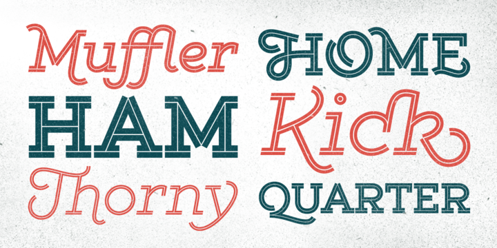
Al Fresco is a breezy, light, yet expressive typeface perfect for packaging products and titling work that calls for a youthful, delectable flair. Its elegance carries a subtle earthiness; its beauty is unconventional, both stylish and exuberant. Al Fresco is made even more versatile when titling is activated (in the OpenType palette), served along with swash forms, contextual alternates, and ornaments to sweeten this tasty typeface.
As with my other type designs, Al Fresco doesn’t live in isolation, but evokes a special ambience, era, or lifestyle—in this case, an enviably carefree, chic, and organically trendsetting life, authentic and true to oneself and simply delicious. Naturally, each designer who uses my work filters it through their unique interpretation, imbuing the fonts with a wonderful array of results such as those found on menus, food packaging, branding for light colognes, or young, hip, clothing boutiques. Al Fresco was born in my imagination as an emblem of dining outside at twilight under twinkling lights, laughing warmly with friends, sipping signature cocktails and eating tapas—each bite dripping with intense flavor. In the workday setting, Al Fresco represents a style that is pretty but not dressy: swishy bright flowery skirts and cute little flats. “Business casual,” not cubicle prisoner. After all, Al Fresco comes from the 18th century Italian “in the fresh air.”


DOWNLOAD BLOG SCRIPT FONT

Technology is making it so that we’re all connected without the need for the physical-presence kind of being connected. That is strange, fascinating, and has a certain magnetism that is very difficult to resist. What’s at stake is no less than the transformation of centuries of human behaviour, and that’s part of the fascination. But while our existence morphs and we rush headlong into our socially minimalist future, we use our present culture to helplessly signal our nostalgia about our past. We know what our future will be missing, and we’re already full of nostalgia about it, but we know that what little we can do about isn’t going to affect the outcome that much.


DOWNLOAD SANT ELIA SCRIPT FONT

Sant’Elia Script from Yellow Design Studio is a robust modern type family with regular and rough versions in six weights. Its letterforms are crisp and welcoming with a splash of verve. Alternate versions feature angled strokes that inject extra energy. Rough weights include three different distress levels that can be mixed for added control and customization. Try Sant’Elia Rough Line, Line Two and Line Three for free!


DOWNLOAD TRUE NORTH TEXTURES FONT

True North is back but now in a distressed version and new styles! True North Textures is a vintage typeface with 18 fonts and a monoline script. True North Textures comes with distressed labels, extras and free banners. Extras include wild animals, catchwords, numbers, mountains, symbols, tools, leaves and trees.
True North Textures is a headline font with alternate capitals. Combine all 18 styles with the script, banners, labels and extras and you get a wonderful distressed vintage design.


DOWNLOAD HOLLIE SCRIPT PRO FONT

Hello! We want to introduce you Hollie Script, Estudio Calderón`s new font.
A typeface that pays tribute to all letterers that created amazing signs in magazines, walls and windows through the brush lettering during many years, especially in the 50s and 60s. This font is 100% based on the brush traces, it has 2100 glyphs, contextual ligatures from two to four characters and alternates for each ligature.


DOWNLOAD MULLER FONT

The very first sketches of Muller were made about four years ago.
In the process they changed to the point where they had nothing in common with the original idea. As it is with most work we do, when we seek perfection, changes are inevitable.
It was specifically designed with a wider structure for better appearance in small sizes and the extra attention to the detail was needed for the big sizes. We managed to find the right balance for the perfect universal font family.